Thursday, July 29, 2010

White-on-White

Design Trend

I wouldn't quite categorize this phenomenon as a coincidence, but several unrelated customers came in during a short period requesting similar designs:  white-on-white.  A white mat and white frame.  Sure, I've sold this design several times in the past, usually on color photography, but never so frequently and on such diverse art.

Below is this clean look on oversize Massimo Vitali photographs from from an interior design site, Coastal Style Living.


I spotted these design images (above) while researching Vitali photos that came through our shop (below), framed in a similar way.  Note that Vitali photos are generally beach shots from above with deliberate washed-out color.  Beautiful.  


This look is very modern and used often in conceptual photo exhibits.  I always warn clients hanging this type of design in their homes that white-on-white looks best on a contrasting color wall, and not nearly as well on a white or off-white wall.  

Below are some recent white-on-white designs on items that are not color photography.

original watercolor 

contemporary artist print

original pencil in distressed white frame with coordinating fillet


Wednesday, July 7, 2010

Flag Waving

A Celebration of Philadelphia Innovation

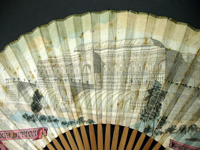
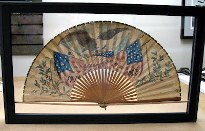
This unique (and well-timed!) object found its way into the shop this season.  It is paper ephemera from the Centennial Exhibition, the 1876 world's fair marking our nation's 100th year, held in our great city.

fan front


detail


The Framing Challenge:

The fan is double-sided.  Handpainted.  Very fragile.  Object must be viewable from both sides.


fan back

detail

Oh, and the fan is to float in the center of the frame, with glass margins on all sides.  No mat.  And adhesive-free if possible (as always).

This was a new one for me.  I took the job in, assuring the customer that I'd figure something out on the worktable.  He trusted me to find a solution.  I talked about it some to framers and other problem-solving types, but ultimately, I went with my own minimalist invention.


The fan is lashed in 2 places to a solid mahogany dowel with monofilament. 


Dowel is fitted into sidewalls.

finished frame (rear view)

Normally, a framer's job is to show no visible attachments.  Here this was not possible.  The mahogany dowel is similar in color to the fan spokes, and I think the simplicity makes for an elegant solution.  Especially when viewed from the front.